setup
부모 컨테이너(이 경우 ul)에 적용하면 된다
css setup
* {
        margin: 0;
        padding: 0;
        font-family: Arial, Helvetica, sans-serif;
        background-color: rgb(212, 212, 212);
      }

      h1 {
        margin: 20px;
        font-size: 20px;
      }

      ul {
        padding: 20px;
        height: 300px;
        display: flex;
      }

      li {
        list-style: none;
        color: black;
        margin: 20px;
        padding: 10px;
        width: 40px;
        font-size: 20px;
        text-align: center;
        background-color: rgb(255, 255, 255);
      }
html setup
<!DOCTYPE html>
<html lang="en">
  <head>
    <meta charset="UTF-8" />
    <meta http-equiv="X-UA-Compatible" content="IE=edge" />
    <meta name="viewport" content="width=device-width, initial-scale=1.0" />
    <title>alignment -- justify-content</title>
  </head>
  <body>
    <h1>align-itmes, align-content</h1>
    <ul>
      <li>1st</li>
      <li>2nd</li>
      <li>3rd</li>
      <li>4th</li>
    </ul>
  </body>
</html>
align-items, align-contents 미리보기
align-itmes, align-content
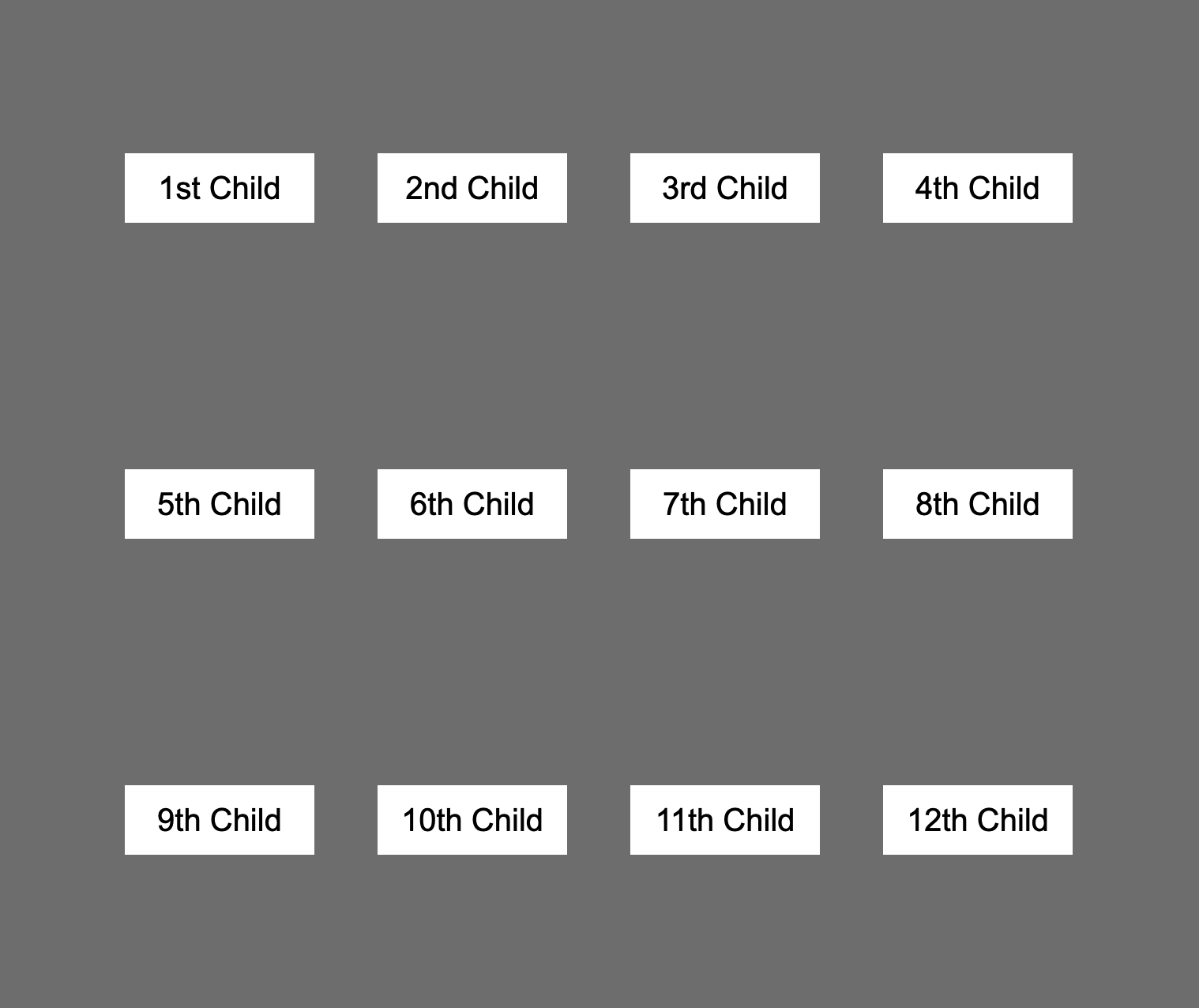
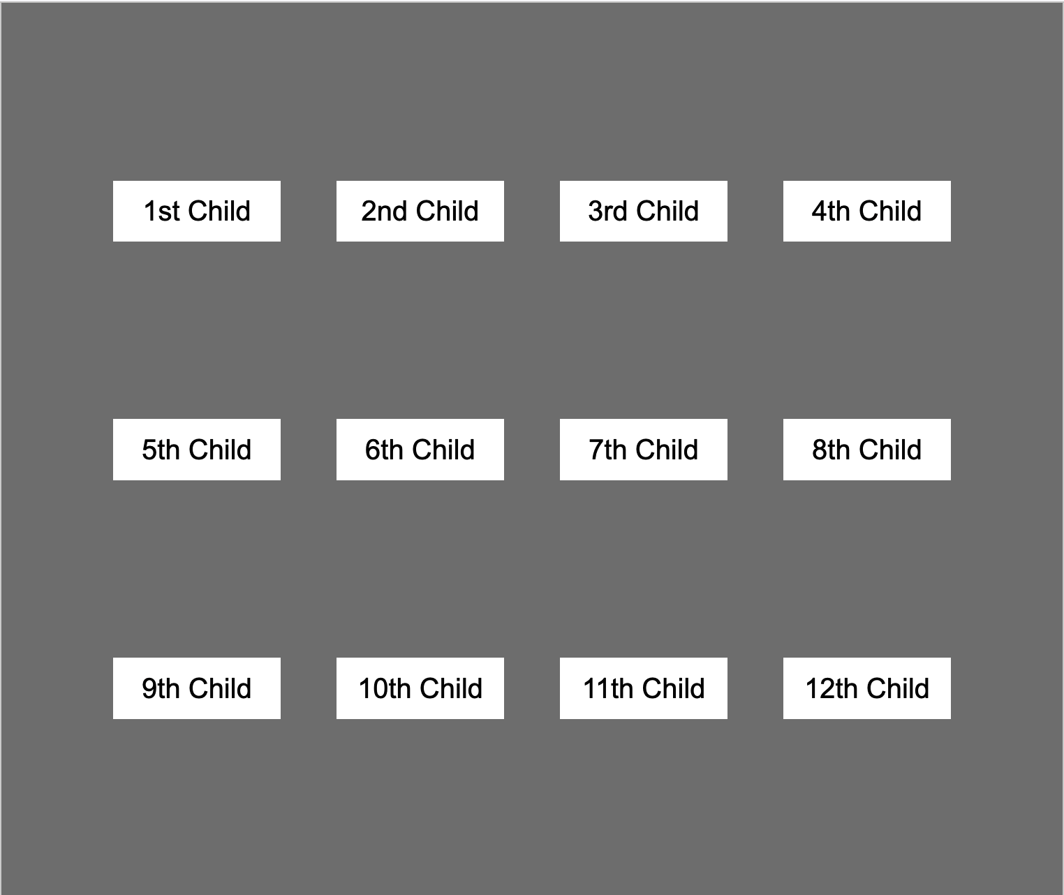
- 1st
- 2nd
- 3rd
- 4th
- 5th
- 6th
- 7th
- 8th
- 9th
- 10th
- 11th
- 12th
justify-content
align-items
align-content
align-items / align-content 차이점
가장 큰 차이점은 적용되는 범위가 다르다는 것이다. align-items은 cross-axis가 가용한 범위 내에서 정렬하는 반면에 align-content는 부모 컨테이너의 모든 범위에서 적용하는 것이 다르다. 그 외의 차이점은 property의 차이다.
| property | align-items | align-content |
| stretch | O(default) | O(default) |
| center | O | O |
| flex-start | O | O |
| flex-end | O | O |
| space-between | X | O |
| space-around | X | O |
| space-evenly | X | O |
| baseline | O | X |
align-items의 경우 space-between, space-evenly, space-around등의 spacing property가 빠지고 align-content의 경우 baseline property가 빠지는 것을 볼 수 있다
Stretch property(default)
align-items, align-property 모두 동일하게 적용된다. 부모 컨테이너의 cross-axis의 가용범위를 모두 사용한다 (stretch 시켜 꽉 채운다). flexbox 적용 시 디폴트로 적용되는 값이다.

center property
align-items의 경우 cross-axis의 center에 자리하게 되고 align-content의 경우 부모 컨테이너의 center에 위치하게 된다
align-items: center;
align-content: center;

flex-start, flex-end의 경우도 동일하게 적용된다.
space-between, space-around, space-evenly property (align-content)


align-items: baseline;
baseline property는 텍스트를 기준으로 정렬한다. 텍스트의 아랫 선에 맞춰 정렬


텍스트의 아랫 선에 맞춰 정렬되는 모습.
'front_end > css-sass' 카테고리의 다른 글
| grid areas (0) | 2022.05.28 |
|---|---|
| grid item 포지셔닝 (0) | 2022.05.26 |
| css grid (0) | 2022.05.20 |
| flexbox alignment 01 (justify-content) (0) | 2022.04.06 |
| css flexbox, flex-direction, flex-wrap (0) | 2022.04.04 |


